About a month ago, I was asked whether it bothered me when people in the city complained about snow, given that I now live in Northern Ontario.
At the time, I gave a sort of non-answer. I don’t even remember clearly what I said, other than no, it doesn’t bother me, but I remember feeling unprepared for the question. The reason for that is because a fresh snowfall was one of Toby’s favourite things.
During his last weeks of life, we were fortunate to have a snowfall in time for Christmas. And a few weeks before that, there was just enough snow to be able to pull him around our Brampton neighborhood on a sled.
So, no: Snowfalls are a source of joy for me, as I hope they are to everyone else who has the fortune to experience one.
Here are some photos of the last snowfall Toby got to see in December 2020.
I’ve spent some time dabbling with large language models like ChatGPT and Bard.
I’m absolutely convinced that AI and large language models, despite their challenges, are the future.
I thought I would try putting into words what it is I think they offer, and also recognize some of their limitations.
What is an LLM and Generative AI?
It might help to level-set a little bit by providing a simple description of what a large language model is. Think of it as a large data set and a self-supervised learning algorithm to understand and summarize statistical relationships in information. The result is a program that can generally understand language and generate probably accurate responses.
I’m adding extra emphasis on probably because it’s important to understand that the algorithm is a probability engine. This means that the algorithm will sometimes get it wrong, leading to some interesting results. The other challenge with the algorithm is with the quality of the data set. Humans are also prone to errors and bias, which can show up in data and influence the outcome.
However, people are also influenced by poor data and the bias of others. It doesn’t change the fact that an AI algorithm is very good at learning processes and systems that people create for themselves for the efficiency of repetitive tasks.
Tasks that can potentially be augmented
AI will shine as an augmentation tool in any kind of repetive process. I suggest this includes fields that have defined “best practices”, including in my field of design and development. I emphasize augmentation because there is a fallacy in the argument that AI will negate the need for people: The data to train AI has to come from experienced people, and experienced people have to start from the bottom.
There are already some instances where AI is used in the market. Chatbots and fraud detection are some examples. But surprisingly, AI is also being tested and used in these fields.
AI is already used in law for processes like e-discovery: Collecting, storing, reviewing, and exchanging information related to a case in digital format. It’s also useful to expedite searching for information in case documents. Contract-related functions is another area where an AI is useful, being able to draw from market standard publicly-filed examples.
Education
AI is a capable tutor. Its ability to generate natural reading language makes it useful to explain complicated math problems.
Graphic Design and Web Development
I have to admit, this one is a little scary for me as it’s my wheelhouse. There are several graphic-generating engines available online, such as DALL·E. There are potential issues with using tools like this (see “What About Copyright?”). AI can also write code, in just about any language. I have personal experience using it to write complicated Regular Expressions (see next section).
What About Copyright?
The challenge with LLMs is that due to their being generative, it’s producing content based on probable statistical relationships. Unless a subsequent check is performed afterward, there is no way to know whether it reproduced a copyright-protected work.
This happens in the creative world too — but there are measures for accountability in these instances. We don’t yet have a good understanding of accountability for the recreation and usage of copyrighted works produced by an AI.
Personal Experience
I have some personal experiences using LLMs. I find ChatGPT is great for less volatile scenarios that rely on a mature knowledge base. In my case, this includes: Writing complicated regular expressions and summarizing video captions into a blog post. But there’s one particular example that I want to dive into:
“Patient Symptom Game”
In May 2023, I decided to tinker with ChatGPT to test a hypothesis. My hypothesis was that, if instructed to do so, ChatGPT was potentially a useful model for diagnosing difficult medical cases based on seemingly isolated symptoms.
The cool thing about tools like ChatGPT is that, if you don’t think it’s giving you responses that are leading in the right direction, you iterate on your prompt to anticipate that. After a few iterations, I arrived at this prompt:
"I'm going to give you a patient's symptoms, one at a time. You will present a possible list of diagnoses in order or most likely to least likely. You will also ask me any clarifying questions to aid in your diagnoses. With each additional symptom I present, you will revise your diagnoses from most likely to least likely, and ask further clarifying questions to aid in your diagnoses."
I began to input the symptoms my son Toby was having over the course of a year, before we later learned he was sick with cancer — fibrolamellar hepatocellular carcinoma. This type of cancer that there is little data on how many people have it. It is thought to make up anywhere between 1-5% of all liver cancers. Until the tumor gets larger, many people with this cancer do not experience symptoms. When they do, they can include:
Pain in the abdomen, shoulder, or back
Nausea and vomiting
Appetite and weight loss
Malaise (having less energy or just feeling unwell)
Toby did have these symptoms, but not at the same time. Complicating this was the fact that his family doctor at the time was dismissive of Toby’s symptoms, so we started taking him directly to the hospital. Then, COVID-19 locked everything down.
Around summer of 2019, Toby was ususually sweaty, often.
In February of 2020, he experienced night nausea.
That summer, he appeared to be losing weight and had less energy.
In August, he looked thin and pale.
In August/September his back was hurting. But his liver hadn’t failed yet, and at this point ChatGPT was correctly diagnosing an issue either with his liver and/or cancer. By October, Toby’s liver had failed and he received his cancer diagnosis.
It is said that with cancer, early diagnosis is key to maximizing chances of survival. Toby’s case was challenging because even after his liver failed, diagnostic imaging was having trouble locating the tumour that they knew was there. So, it’s possible that they would not have been as persistent in scanning for a liver tumour if his liver hadn’t failed yet.
But, there’s also a chance that, with enough compelling data, they might have known where to look and find the tumour. They they might have gotten Toby onto immunotherapy sooner, before his liver failed, and that it might have been sufficient to shrink the tumour to the point where it could have been resected, and that he might still be alive today, 3 years later — long enough to be able to trial a promising vaccine that might be viable for managing the tumour.
Diagnosing a month or two sooner could have given Toby years more of life. AI augmented diagnostics will absolutely make a difference for countless cancer patients in the future.
At one point, I think I had gotten pretty good at provocative conversation, without being offensive, when it came to discussing progressive ideas. But since Toby died, I’ve had to work and continue to work very hard to build and maintain energy to get through a day. I don’t have the energy to rehearse talking points in my head, preparing for public council meetings, or the next social media spat.
But I still care about what I care about.
During my lunch today, I started chatting with an older gentleman. I’m not sure what sparked it, but he began to tell me every conspiracy-theory factoid you can imagine, smashed into one steaming hot sandwich.
I immediately felt my energy draining with every point he was trying to make that I wanted to refute. I wasn’t going to get through the day if I did so.
So, I listened, and something interesting happened. Every once in a while, he would say something that seemed to contradict what I would call a typical “conservative” narrative.
He asked about what I do, I mentioned how I work from home. He noticed that a lot of people had been moving north from the city. I mentioned how it’s become crazy-expensive in Toronto, and we both knew that Timmons, Ontario has some of the lowest real-estate prices right now. We both knew that would put pressure on cities to keep their people, and on Northern towns to build out infrastructure for more people.
He noticed that growing season has been starting earlier up north, and that Western Canada has been having drought that’s impacted food production. I mentioned about how the entire province is expected to get warmer because of climate change. And, I even got him to agree that carbon taxation isn’t terrible as long as it can be seen to be doing the work of offloading our reliance on carbon-producing products.
What do these things have in common? Money.
People will believe whatever they want. But take it from someone who no longer has the mental fortitude to argue, it’s not worth trying to break through the compacted layers of mistruths. But if you can find the money toothpick holding that mistruth sandwich together, you might just get someone to pause to think for a beat.
I’m not gonna lie: I’ve become a big fan of Quickbase.
In my history of designing applications, learning to code was necessary to achieve my goals. But Quickbase, for the most part, removes that need and instead lets me focus on data architecture and prototyping with no/low code.
But there are still some aspects of managing Quickbase apps that are a bit of a nuisance, particularly as an app matures, and with it, more Users and Roles are brought on board that require careful management.
But what if table access could be managed more easily, and with more flexibility, using a RACI? This post describes a prototype for doing just that.
What is a RACI?
RACI is an acronym that stands for Responsible, Accountable, Consulted, and Informed. It’s a tool used in project management and organizational workflows to define and clarify roles and responsibilities within a team or across different stakeholders.
Responsible (R): This role refers to the person or individuals who are directly responsible for completing a specific task or activity. They are the ones who perform the work and ensure its completion.
Accountable (A): The accountable role represents the person who is ultimately answerable for the overall outcome or result of a particular task or project. This individual has the authority to make key decisions and is responsible for ensuring that the task is completed successfully.
Consulted (C): This role includes individuals or stakeholders who provide their input, expertise, or advice on a particular task or decision. They are consulted for their insights, but they are not directly responsible or accountable for the task’s completion.
Informed (I): The informed role includes individuals or stakeholders who need to be kept up-to-date on the progress, decisions, or outcomes of a task or project. They are kept informed about relevant information but do not have active participation or decision-making authority.
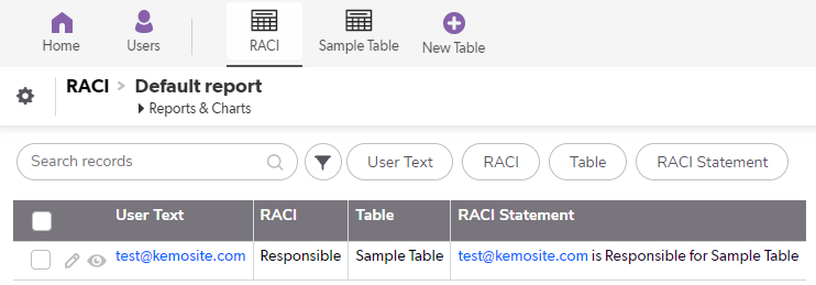
By using a RACI matrix, teams can define and communicate the roles and responsibilities associated with different tasks or activities. In this example, it will define access permissions for an example table. The neat thing about this method is that it doesn’t require table-to-table relationships, only formula queries. Here we go!
Setting up the RACI table
The RACI table describes who has what permission in which Table. Each Record defines a single instance associating a User to a Table. If a User has access to more than one Table, they need to be defined individually. But, Records can be copied to expedite this process.
I’ve set ordered the fields in my form to create a sort of “RACI statement”, which I’ll demonstrate here also.
Fields To Setup
Users (User)
User Text (Formula – Text)
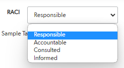
RACI (Text – Multiple Choice)
Table (Text – Multiple Choice)
Optional: RACI Statement (Formula – Text)
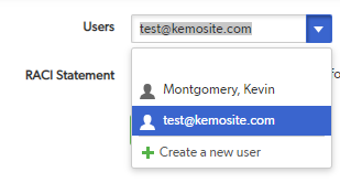
Users
The first field, the “who” field that I’m using, is a simple User field that will display all of the Users of your app. You can use other selectors like groups or teams you’ve defined, as long as you have a way to evaluate and compare in each table.
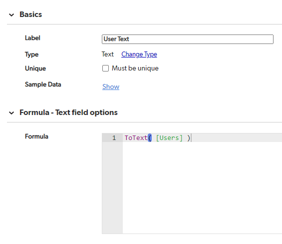
User Text
This field is a formula text field, and converts the selected Users field to text for evaluating and comparing in other tables.
RACI
The RACI field is a multiple-choice text field, and contains the values Responsible, Accountable, Consulted, and Informed.
How these selections will translate into permissions is completely up to you. I’ll show you an example I’ve put together, that can be copied and pasted into every table of my app where I want to apply the respective permissions.
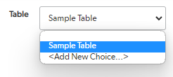
Table
This is also a multiple-choice text field, that contains table identifiers. It would probably be more effective to use table IDs, but that makes it difficult to read and present. You’ll need to add separate table entities for each table you want to control access to.
RACI Statement
Not essential, but fun. The RACI Statement is a text formula field that uses the formula:
ToText( UserToName( [Users] ) ) & " is " & [RACI] & " for " & [Table]
I think it’s a nice way to confirm the setup.
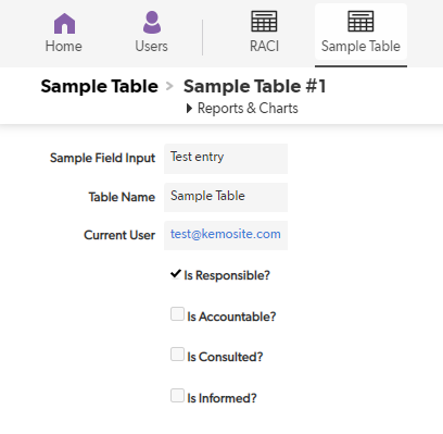
Setting up a table
In your table where you want to control access via RACI, you’ll need to add 6 formula fields:
Table Name (Formula – Text)
Current User (Formula – User)
Is Responsible? (Formula – Checkbox)
Is Accountable? (Formula – Checkbox)
Is Consulted? (Formula – Checkbox)
Is Informed? (Formula – Checkbox)
Formula: Table Name (Formula – Text)
The formula for the Table Name field is a hard-coded value for the name of the table you’re working in, in this example: “Sample Table”.
There are arguably better ways, such as using the dbid() function. However, for this example, I wanted to focus on something reader-friendly. Whatever the value you use, it must match the value of the “Table” field in the RACI table.
Formula: Current User (Formula – User)
The formula for the Current User field is simply: User()
What it will do is confirm the current user, and match it against “Users” field in the RACI table for subsequent formula queries.
For the next 4 formulas, you’ll need to know how formula queries work, how to locate field IDs, and table shortcuts, which is outside the scope of this post. For more information on that, I suggest checking out Quickbase Junkie tutorials.
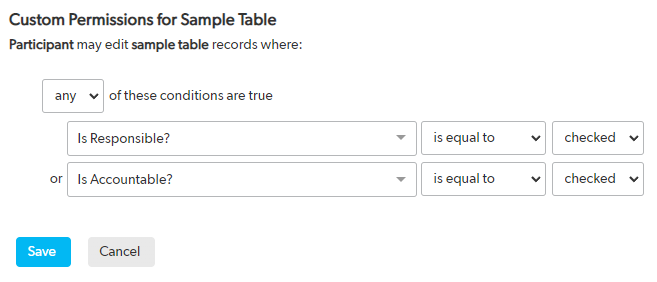
Each of these formula queries will check Records in the RACI table to determine what your permissions are in the table you’re using. In this example, the test user is “Responsible” for this table, demonstrated by the automatically checked checkbox. It should be copyable into any table where these formula checkboxes are created.
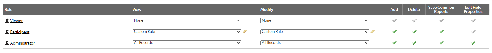
Adjust Table Access
The next thing to do is adjust table access permissions, and this is where the investment into controlling permissions at the front end pays off.
In this example, Administrators can manage everything, viewers can’t do anything, and Participants can add Records, as well as view and modify them according to Custom Rules.
The View rules are as follows:
The premise for this is simple: If you have any business in this table, then you can view Records.
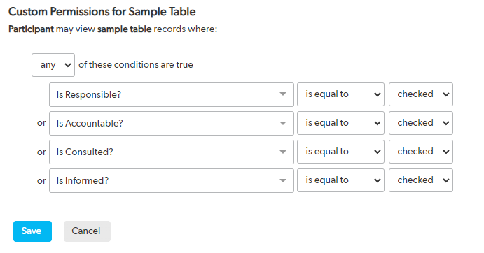
You can have different rules to determine who can modify Records in this table:
In this example, we can assume that the people with permissions to modify Records are those that are expected to complete tasks, and are accountable for making sure they’re done. People that only need to be informed don’t necessarily need to be able to edit Records but should be able to view them.
While there is some up-front investment of time in setting this up, the benefit is that maintaining app table permissions in the long term becomes much simpler.
What do you think? Do you think a setup like this is worth the time to set it up? Let me know!
They can be useful to resolve complicated issues, bringing together the perspectives of stakeholders at the same time.
But that’s also an expensive use of time. And the value of that investment of time depends on how well-prepared one is for the meeting, and on the clarity of actionable items to come out of them.
Here are some of the tactics I use to help me organize effective meetings, and manage my time around them.
Block time: First thing in the morning, and after lunch
Every business day, I have a repeating schedule to block off time first thing in the morning and after lunch. This gives me time to prepare my action/agenda items for meetings later that morning or afternoon. It also gives me time to check my email in case any of the other attendees have indicated a change to the meeting, either in the agenda, or the schedule.
Block time: Before and after meetings
Back-to-back meetings are. The. Worst. That’s why, with every meeting I schedule, I block off time before and after it.
Before a meeting, this gives me time to transition from my work and prepare for my meeting, including taking a bio-break and refilling my coffee.
After a meeting, it gives me time to consolidate notes and process takeaways, and prepare action items before resuming my work or joining the next meeting.
I also offer this courtesy to my colleagues: I avoid booking a meeting immediately following an event in their calendar, and never on the same day unless it’s urgent.
How do you manage your meeting schedule? Let me know in the comments!